Hawthorne Valley Farm
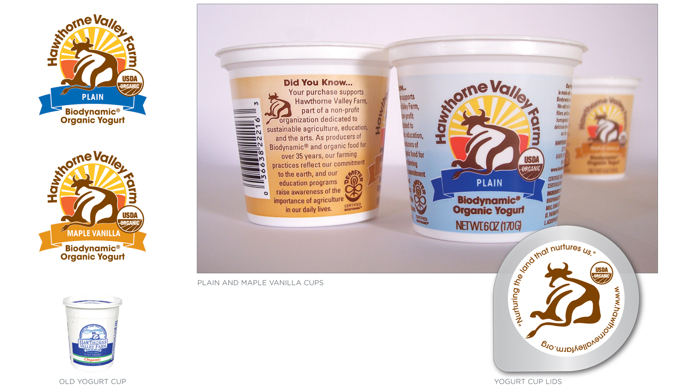
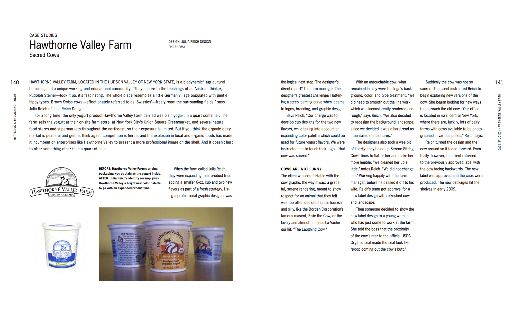
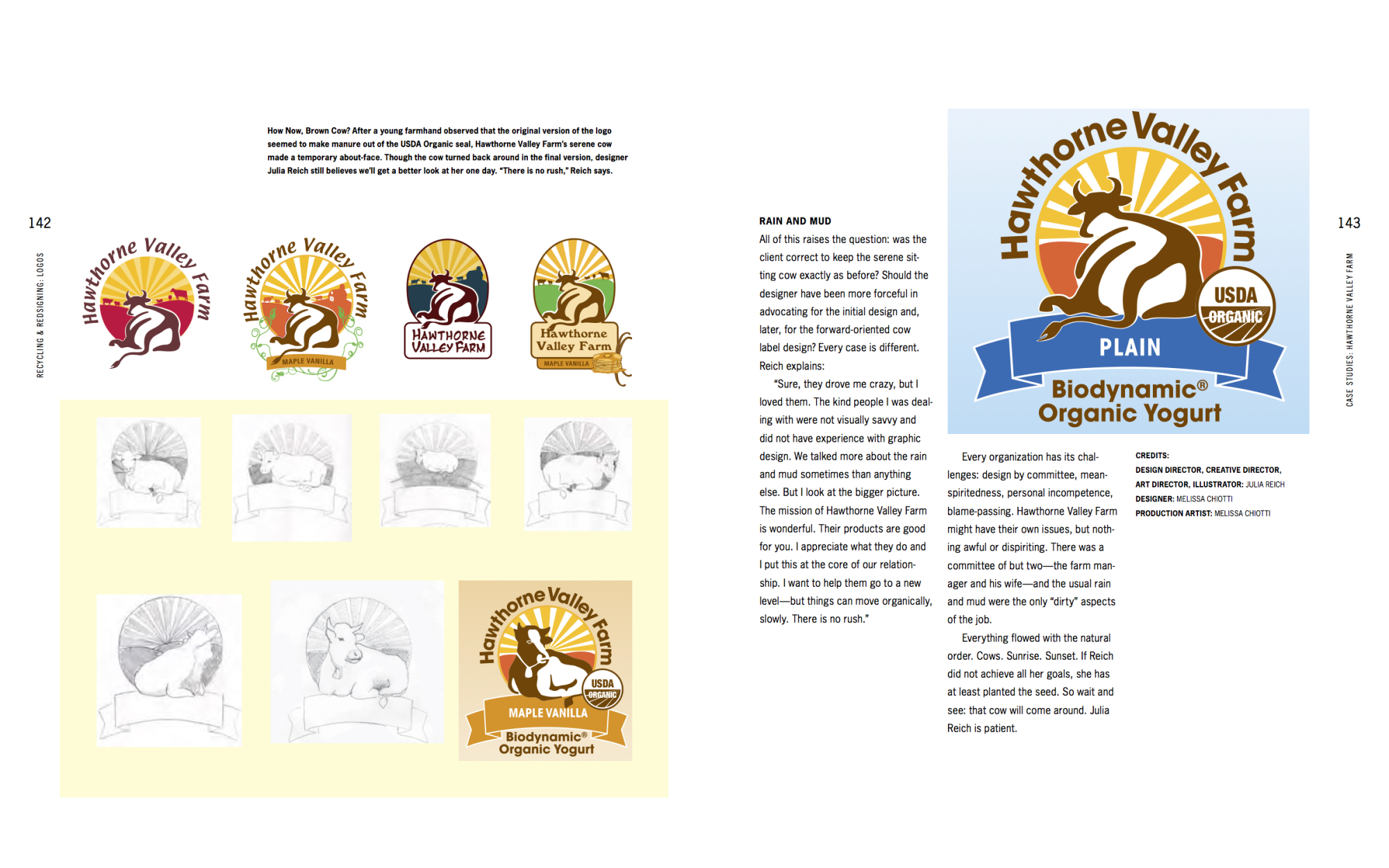
This project was a redesign of Hawthorne’s original yogurt logo, cup and lid. The company wanted a more modern look to attract today’s consumer who is interested in an organic wholesome product that is produced with the use of no electricity. True to the equity of its brand, the cow of the logo remains, but with much cleaner rounded edges. The areas of vibrant color and the open san-serif font are bold and honest. Changing colors in the ribbon and background gradient differentiate between flavors. The design of this yogurt cup went through extensive analyzing to meet all of the New York Ag and Markets, USDA and Demeter standards.
**Published in Recycling and Redesigning Logos: A Designer's Guide to Refreshing & Rethinking Design (Rockport Publishers, 2010)**


